In 2014 I published a book titled Interstices & Intersections or, An Autodidact Comprehends a Cube.
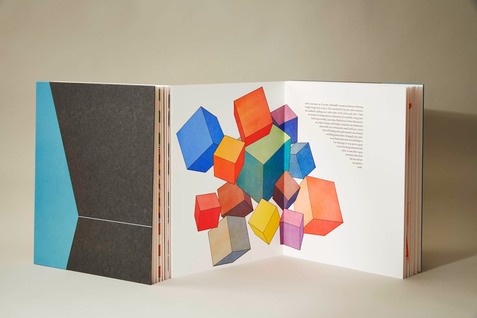
The book featured thirteen Euclidean propositions, one from each of the books of Euclid’s Elements of Geometry. I wrote a companion text for each proposition and drew accompanying illustrations for both texts. Euclid’s Elements of Geometry is in many ways an ideal text with which a book artist can work because its content is equally dependent on word and image to be understood.
Each Euclidean proposition is accompanied by a visual diagram that works with the text to explicate the proposition. These diagrams were developed over centuries, beginning in the manuscript era and crossing over into printed books. The result is an uninterrupted, millennium-old lineage of word/image parity; the Euclidean diagrams that we use today were used, with little variation, in the ninth century.
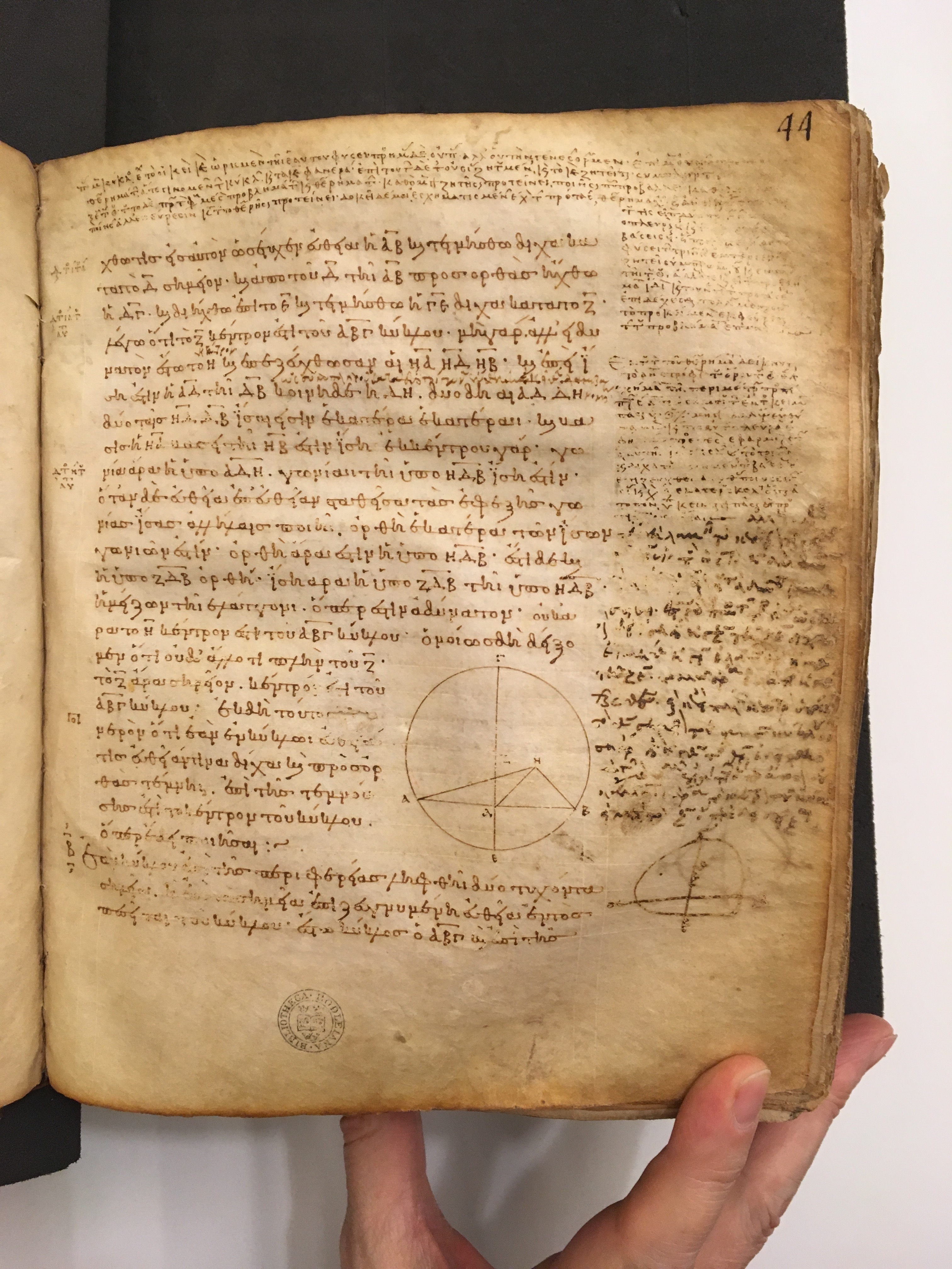
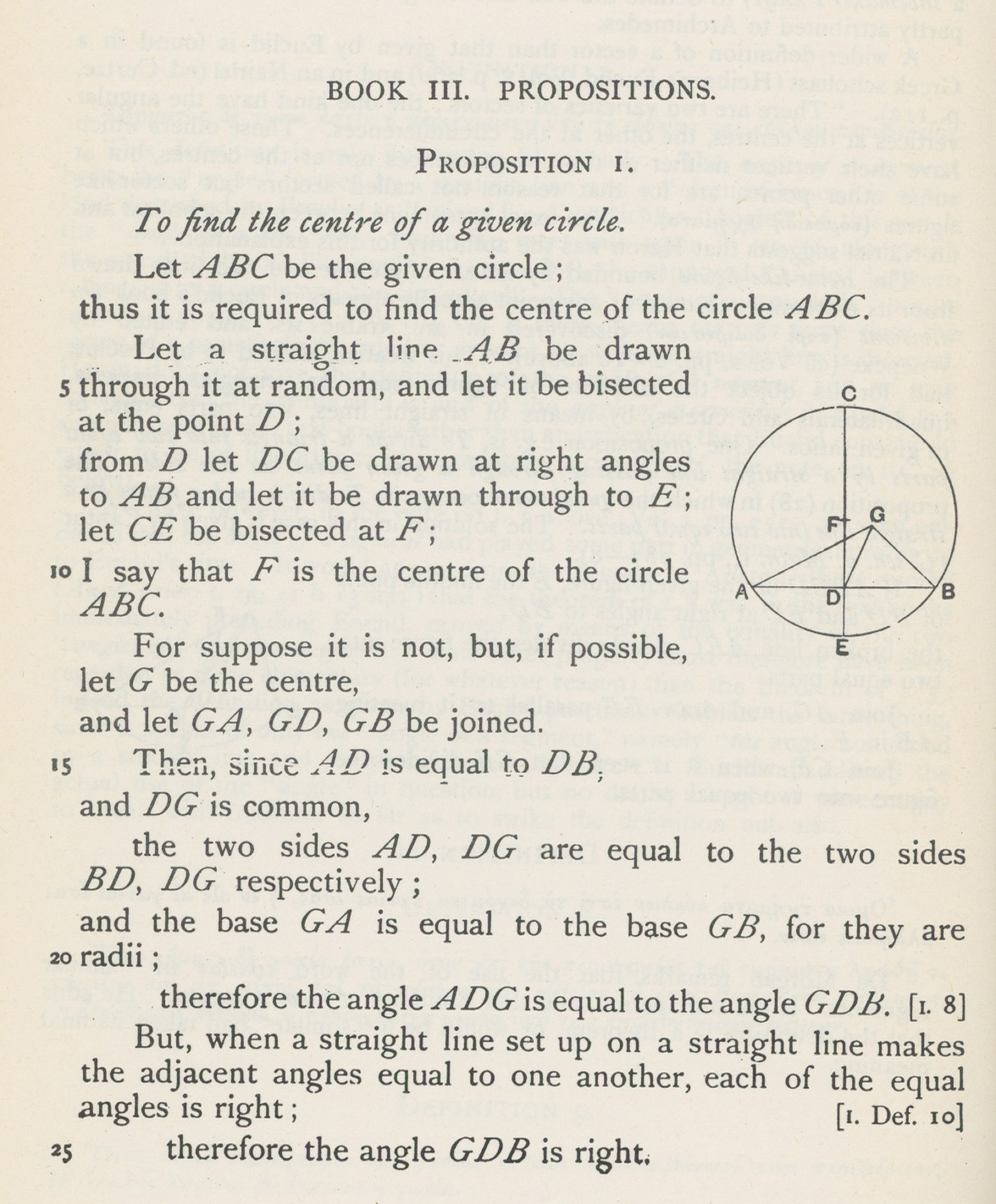
There is no consistent hierarchy among text and diagram in Euclid; sometimes the diagram illuminates the text, other times the text is the only point of access to the diagram.
In Euclid’s Books XI, XII, and XIII, the three books that deal with three-dimensional form, the relationship between text and diagram steadily changes as the forms described become increasingly complex. The diagrams in Book XI and most of Book XII are notable for their clarity, simple three dimensional forms possessed of an easy familiarity. The accompanying texts are by contrast quite elaborate: arriving at a simple form is not always a simple process.
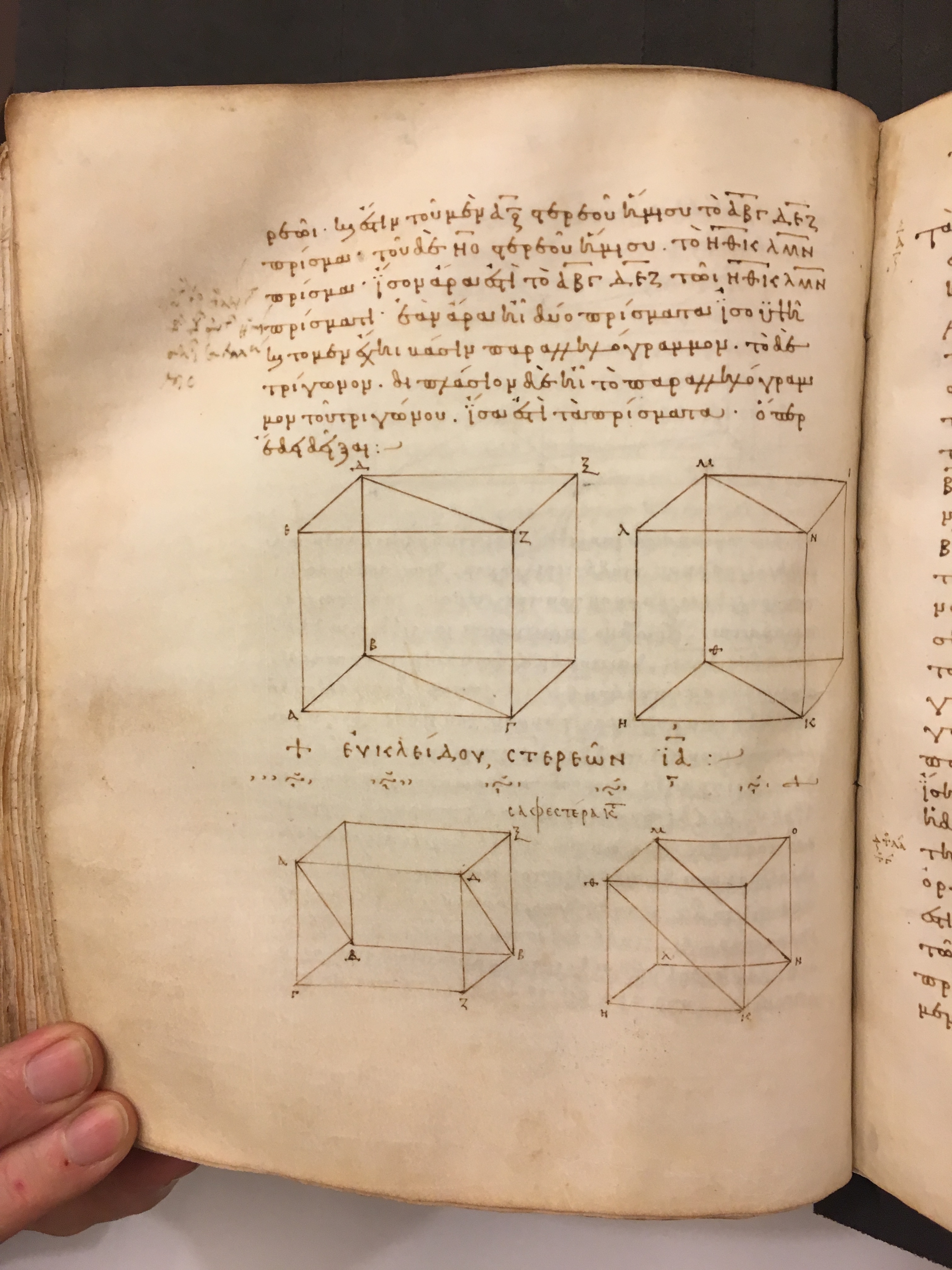
As the reader progresses into Book XIII, the relationship between text and diagrams begins to change. Although the propositions are quite dense, the forms they describe are so complex and convoluted that the diagrams used to represent them suffer under the glut of information. Rather than fleshing out the three-dimensional forms, the diagrams tend to collapse back into two dimensions.
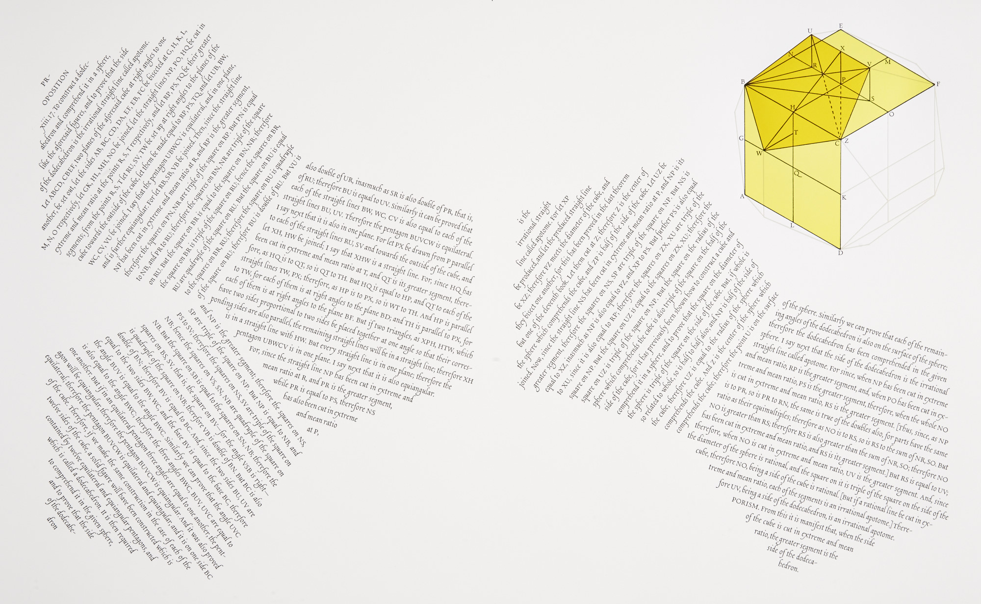
This is particularly true for Propositions xiii.17, To construct a dodecahedron and comprehend it in a sphere…., the diagram of which has always struck me as inadequate.
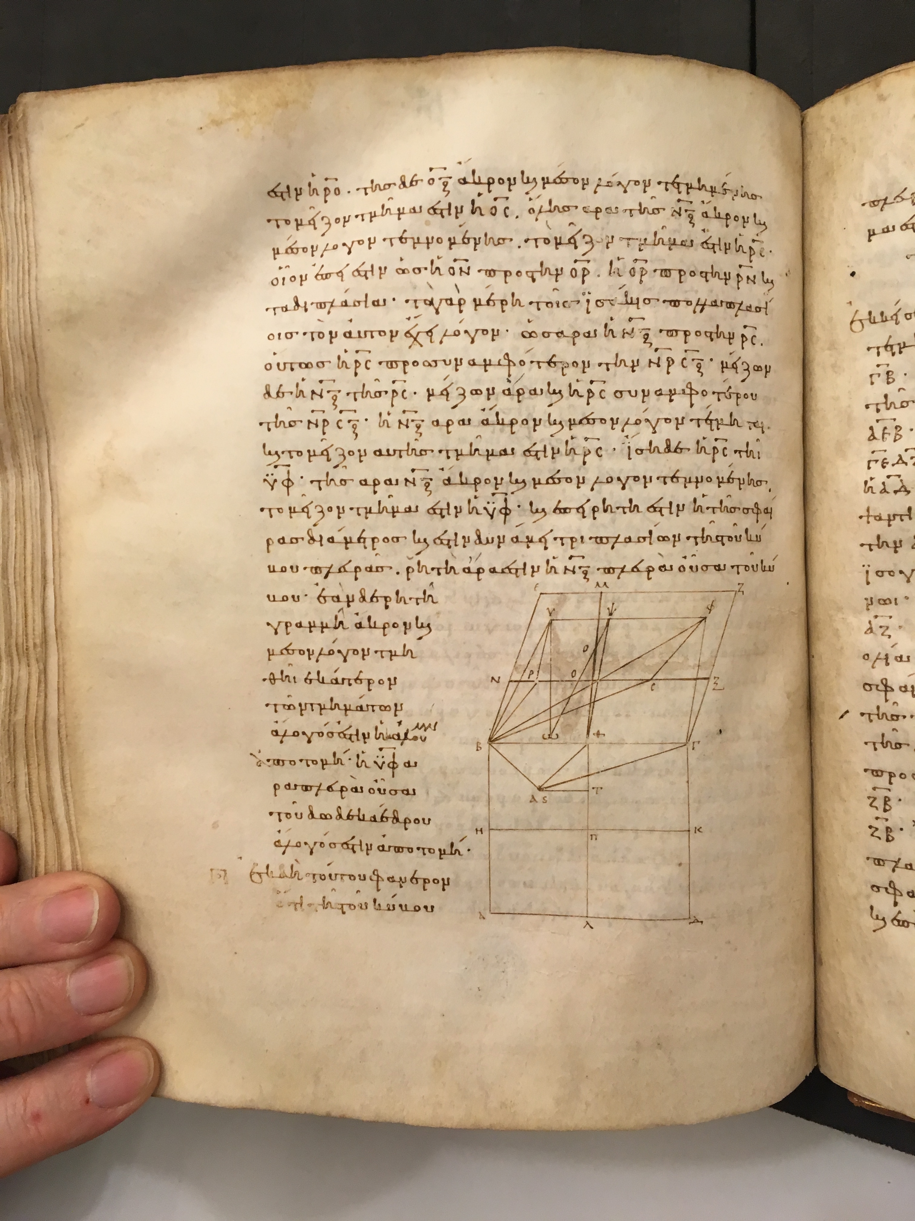
The diagram shows one pentagonal panel of a dodecahedron as it is drawn around a cube, but rather than being obvious, the diagram requires the text to be understood. At first glance (and second, third, etc.) it is not at all obvious that we are meant to be drawing a dodecahedron within a sphere.
For my edition of Euclid, I tried to devise diagrams that were respectful of the traditional forms but that used color and altered perspectives to present the information in a new, hopefully clearer, way. For Proposition xiii.17, I drew the traditional diagram at a more oblique angle than is typically done. I then printed the traditional elements in differing shades of yellow to provide a separation between the pentagon and the cube, and fleshed out both the cube and the dodecahedron in a pale gray. For added fun, I set the text of the proposition in five equilateral pentagons.
